웹 네비게이션의 10가지 종류와 예시
원문 : https://umbrellait.com/website-navigation-design/
Website Navigation is a top priority for any site.Why?Because it is the thing that can either help a user to find relevant information or make him leave with disappointment.But in web navigation the rules are silent. You can make it clear and intuitive or layering and unconventional.Web-development studio Umbrella IT is here to answer all your questions.But first things first.
WHAT IS WEB NAVIGATION?
Web navigation is a system of software tools and visual means which help users to know where they are at all times and provide them the necessary information.
WEB NAVIGATION PLANNING
Three pillars the most effective web navigation leans on are:
- Structure
- Minimalism
- Design
Structure: website navigation starts with the detailed design of the Information architecture (IA), that provides optimal access to a site and arranges the content from a user’s perspective. Ideally, IA consists of a minimum number of navigation layers and provides access to the desired website section in just a few clicks. Yet the website section division must be clear, logical and predictable.
Minimalism: efficient web page navigation is always simple and user-friendly. Add only those elements to your menu design that are essential for the effective communication. The key to success is a menu bar consisting of a minimal number of equal sections that eliminate any error.
Design: when selecting a design focus on readability, integrity, and harmony. Opt for the standard elements: the intricate system of icons, buttons, and shortcuts is a bad idea that can backfire on your site’s aesthetics and usability. The simpler the web design navigation, the bigger amused audience.
TRENDS IN WEB NAVIGATION DESIGN
Web design is highly versatile however some of its forms have gained more traction than the others. Umbrella IT has chosen 10 examples of website navigation design that looks like a great option. Each of them has its own benefits and drawbacks, but which one is the best? It’s totally up to you.
1. HORIZONTAL NAVIGATION
Horizontal type is a classic design that combines usability and functionality.
1. 수평 내비게이션
수평한 유형은 사용성과 기능성이 결합된 클래식한 디자인입니다.

Pros:
Natural solution for a standard orientation of the majority of screens;
All the elements are active and accessible at once;
You can expand the main menu bar options by use of drop-downs in just a tap or a click.
장점
- 대부분의 스크린의 표준 방향을 위한 간단한 솔루션입니다.
- 모든 요소는 한번에 활성화 됩니다.
- 탭 또는 클릭으로 드롭다운을 사용하며, 기본 메뉴 표시 줄 옵션을 확장할 수 있습니다.
Cons:
Large number of website sections and mega drop-downs can interfere with the important content;
Addition of new menu options is complicated.
단점
- 많은 수의 웹 사이트 섹션과 메가 드롭다운이 중요한 콘텐츠를 방해할 수 있습니다.
- 새로운 메뉴 옵션을 추가하는 것은 복잡합니다.
2. VERTICAL NAVIGATION
Vertical navigation is an obvious alternative to a horizontal one, where the menu is situated at the left side of the page. Basically, vertical and horizontal designs are interchangeable and sometimes complementary. The choice between them is based on personal preferences and intention of content.
2. 수직탐색
수직 탐색은 메뉴가 페이지의 왼쪽에 잇는 수평 탐색의 확실한 대안입니다. 기본적으로 수직 및 수평 디자인은 상호 교환 가능하며, 때로는 보완적입니다. 이 디자인은 개인적인 취향과 내용의 의도를 나타낼 수 있습니다.

Pros:
Simple editing and unlimited menu expansion make it a perfect choice for complex multifunctional services and e-commerce sites;
First choice for mobile devices.
장점
- 간단한 편집 및 무제한 메뉴 확장으로 복잡한 다기능 서비스 및 전자 상거래 사이트에서 완벽합니다.
- 모바일 기기를 위한 최고의 선택입니다.
Cons:
It can interfere with the content in expanded mode;
Lower discoverability of elements at the menu’s bottom.
단점
- 확장된 상태에서 컨텐츠를 방해할 수 있습니다.
- 메뉴 하단에서 요소의 검색 가능성을 낮춥니다.
3. SLIDE-OUT MENU
Slide-out menu is one way to save both full navigation capacity and screen real estate. The menu bar (or side drawer) is hidden beyond the left edge of the screen and revealed only upon the user’s action.
3. 슬라이드 아웃 메뉴
슬라이드 아웃 메뉴는 전체 탐색 용량과 화면 공간을 모두 절약하는 한가지 방법입니다. 메뉴 막대 또는 측면이나 서랍에서 화면 왼쪽 가장자리 너머 숨겨져 있으며 사용자에게 작업에만 표시됩니다.

Pros:
Very compact arrangement of website’s content;
Design can be adaptive and in combination with hamburger-icon makes a great choice for mobile web browsing;
Slide-out menu makes users focus on the content rather than on anything else;
Access to the menu is available from any website’s point.
장점
- 웹 사이트 컨텐츠의 매우 컴팩트 한 배열
- 디자인은 적응력이 뛰어나고 햄버거 아이콘과 함께 사용하면 모바일 웹 브라우징에 적합합니다.
-슬라이드 아웃 메뉴를 통해 사용자는 다른 것이 아니라 컨텐츠에 집중할 수 있습니다
- 모든 웹 사이트에서 메뉴에 엑세스 할 수 있습니다.
Cons:
Hidden navigation is less discoverable;
It can interfere with the content in expanded mode.
단점
- 숨겨진 탐색 기능을 쉽게 찾을 수 없습니다.
- 확장 모드에서 컨텐츠를 방해할 수 있습니다.
4. LANDING
Landing page is a task-optimized single-page website with long or infinite scrolling.
4. 랜딩 페이지
랜딩 페이지는 길거나 무한 스크롤 되는 작업에 최적화 된 단일 페이지 웹사이트입니다.
Pros:
Scrolling is faster than clicking – a good fit for news services, online stores, and real-time websites;
Long or infinite scrolling holds users’ attention;
It is highly suitable for websites with a large volume of visual content;
User-friendly design for the mobile web.
장점
- 스크롤은 클릭보다 빠릅니다. 뉴스, 온라인 상점 및 실시간 웹 사이트에 적합합니다.
-길거나 무한한 스크롤은 사용자의 관심을 유지합니다.
- 시각적인 컨텐츠가 많은 웹사이트에 매우 적합합니다.
- 모바일 웹을 위한 사용자 친화적인 디자인입니다.
Cons:
Restrained user’s freedom: you can’t control the order of information and way for representing content;
No footer;
Higher server load;
SEO drawbacks.
단점
- 제한된 사용자의 자유 : 정보의 순서와 컨텐츠를 표현하는 방법을 제어할 수 없습니다.
- 바닥 글 없음
5. FIXED NAVIGATION
Fixed or sticky navigation is a type of the menu bar that doesn’t disappear when you’re scrolling down: it is attached to a certain part of the page and provides access to the menu at all time.
5. 고정탐색
고정 또는 고정탐색은 스크롤 할 대 사라지지않는 메뉴 표시줄의 한 유형입니다.
페이지의 특정 부분에 첨부되어잇으며 항상 메뉴에 엑세스할 수 있습니다.
Pros:
Menu is accessible from any website’s point – great choice of design for a landing page;
Brand awareness can be built with a company logo appropriately inserted into the header;
SEO is improved by increasing the number of web pages being viewed for a single visit.
장점
- 메뉴는 어느 웹 사이트에서나 엑세스할 수 있습니다. (랜딩 페이지를 위한 훌륭한 디자인을 선택)
- 브랜드 인지도는 회사 로고를 헤더에 적절하게 삽입하여 만들 수 있습니다.
- 한 번의 방문으로 볼 수 있는 웹 페이지 수를 늘려서 SEO를 개선합니다.
(SEO =search engine optimization)
Cons:
Overwhelmed and annoying header is non-userfriendly and able to block the content.
단점
- 압도적인 성가신 헤더는 사용자에게 친숙하지 않으며, 콘텐츠 차단을 할 수도 있습니다.
6. HAMBURGER MENU
Hamburger menu is a type of menu initially designed for smartphones but now it’s used for all browsers and devices with ever-increasing frequency. The three-parallel-horizontal-lines icon (displayed as ☰) usually found at the top right or left corner of the page hides a wide range of options and categories. The icon has the resemblance to the 3 layers of a hamburger – that’s where it derived its name from.
6. 햄버거 메뉴
햄버거 메뉴는 처음에 스마트폰 용으로 디자인된 메뉴 유형이지만 이제는 점점 증가하는 주파수를 가진 모든 브라우저 및 장치에서 사용됩니다. 일반적으로 페이지의 오른쪽 상단 또는 왼쪽 모서리에 있는 3개의 평행한 가로 선 아이콘을 다양한 옵션과 범주를 숨겨줍니다.

Pros:
The menu functionality is boosted by hiding a large number of options behind the icon;
The menu is constantly available from any website’s point;
Large number of options;
As an additional menu arranges secondary options (history, settings, payment) a screen or a user being overwhelmed.
장점
- 아이콘 뒤에 많은 옵션을 숩겨 메뉴 기능이 향상되었습니다.
-메뉴는 모든 웹 사이트 지점에서 지속적으로 제공됩니다
- 많은 옵션
- 추가 메뉴로서 보조 옵션 설정, 이력 등 화면 또는 사용자에게 가이드를 줄 수 있습니다.
Cons:
Low discoverability: despite being frequently used some users still have problems with hidden menu identification so it is recommended as a secondary menu;
Hamburger menu is a de facto symbol to start the site exploring on Android, but on iOs it is not that popular and leads to clashing with basic iOs navigation elements that might overload the menu bar.
단점
- 낮은 검색 가능성 : 자주 사용되지만 일부 사용자는 숨겨진 메뉴 식별에 여전히 문제가 있으므로 보조 메뉴를 권장합니다.
- 햄버거 메뉴는 안드로이드 사이드를 탐색하기 위한 사실상의 상징이지만, iOS에서는 그렇게 인기가 없으며 메뉴 막대에 과부하를 줄일 수 있는 iOS 탐색 요소와 충돌합니다.
7. RESPONSIVE NAVIGATION
Responsive navigation is a variable design that serves all devices with the same code automatically adjusting for screen size.
7. 반응형 네비게이션
반응형 네비는 화면 크기를 자동으로 조정하는 동일한 코드를 가진 모든 장치에 서비스를 제공하는 가변 디자인입니다.
Pros:
Cross-platform compatibility;
Single URL: you don’t have to create a separate mobile version of the site and no redirection means higher SEO.
장점
- 플랫폼 간 호환성
- 단일 URL 별도의 모바일 버전 사이트를 만들 필요가 없습니다.
Cons:
Desktop’s typical active elements (embedded maps, videos, animated elements) slows the page load time down on mobile platforms;
Mobile audience prefer narrower set of functions than desktop audience for which reason mobile version of site’s design can be unreadable and overloaded;
No alternatives: if you have a separate mobile version you can always return to a full version of the site. It’s impossible for a separate mobile version. If a responsive design is inconvenient or hides a crucial element of navigation the only solution is to find a desktop or switch to a competitor.
단점
- 데스트톱에서 일반적인 활성 요소 (내장 맵, 비디오, 애니메이션 요소)는 모바일 플랫폼에서 페이지로드 시간을 느리게 합니다.
- 모바일 사용자는 데스크톱 디자인보다 좁은 기능 집합을 선호하므로 사이트 디자인의 모방리 버전을 읽을 수 없고 오버로드 될 수 있습니다.
- 대안없음 : 별도의 모바일 버전이 있는 경우, 언제든지 정식버전의 사이트로 돌아갈 수 있습니다. 별도의 모바일 버전에서는 불가능합니다. 반응형 디자인이 불편하거나 탐색의 중요한 요소를 숨기는 경우. 유일한 해결책은 데스트톱을 찾거나 경쟁 업체로의 전환하는 것입니다.
8. MEGA MENU
Mega Menu is a large menu panel that pops-up when tapping or pointing a mouse cursor over the necessary menu section.Mega menu sorts the content by groups and columns use different visual means.
8. 메가메뉴
메가 메뉴는 필요한 메뉴 섹션 위로 마우스 커서를 두드리거나 가리킬때 나타나는 큰 메뉴 패널입니다. 메가 메뉴는 콘텐츠를 그룹별 정렬하고 열은 다른 시각적인 수단을 사용합니다.
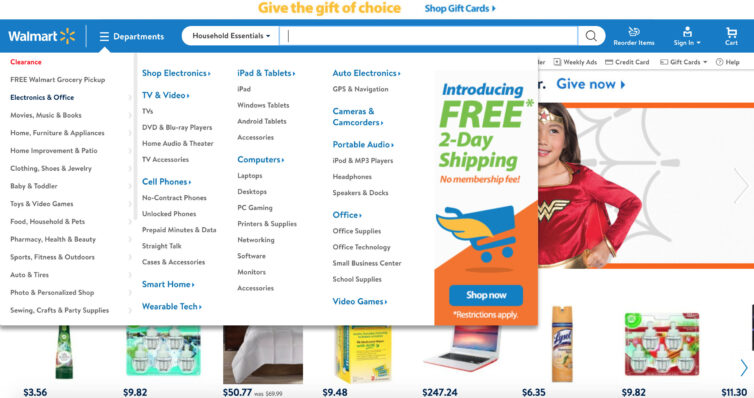
Pros:
All the options are accessible at once: quickest possible user’s direction make the mega menu a perfect choice for online stores with a bevy of options, categories, and services;
It pops-up and pops-down upon the user’s action.
장점
- 모든 옵션은 한 번에 엑세스할 수 있스빈다. 가장 빠른 사용자의 지시에 따라 메가 메뉴는 옵션, 카테고리 및 서비스가 많은 온라인 상점에 완벽한 선택입니다.
-사용자의 동작에 따라 팝업, 팝다운이 됩니다.
Cons:
the illogical content division comprises the whole system;
it’s difficult to be implemented on mobile platforms.
단점
- 비논리적 내용 분할은 전체 시스템을 구성합니다.
- 모바일 플랫폼에서는 구현하기가 어렵습니다.
'Research > UX UIdesign' 카테고리의 다른 글
| 심리학UX : Law of Paragnanz 단순성의 법칙 (0) | 2020.06.12 |
|---|---|
| UX 카피라이팅 : A / B 테스트 + QUIZ를 능가하는 복사 테스트 3가지 방법 (0) | 2020.06.12 |
| 모바일 마이크로세션 무엇인가? Mobile Microsessions (0) | 2020.06.12 |
| 2 Ways To Improve User Interview Questions (0) | 2020.06.12 |
| Applying machine learning to your UX research process (0) | 2020.03.20 |